Most platforms will let you upload a workout video in almost any shape.
That doesn't mean it will look good.
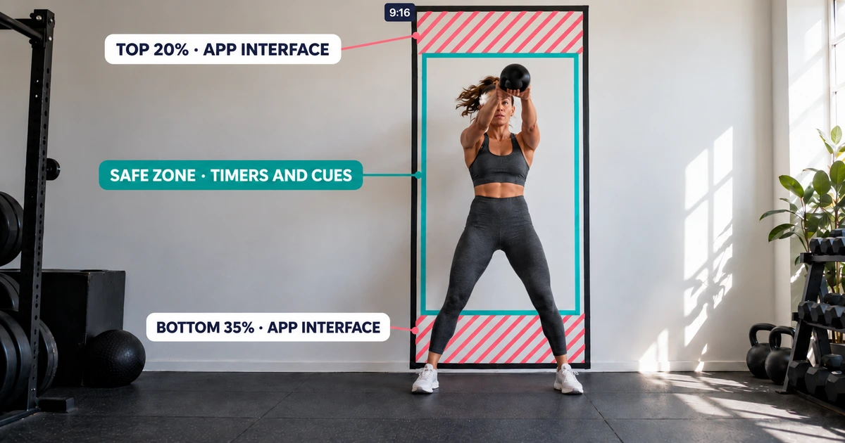
TikTok, Instagram Reels and YouTube Shorts all place buttons, usernames, captions and other controls directly over your video. For workout content, that creates a specific problem: the timer, exercise name, rep counter or "next up" box can easily end up behind the app interface.
Most video-format guides are written for simple talking-head videos. Workout videos need a little more planning.
This guide covers three things:
- Which video shape works best on each platform.
- Where to place important information so the app doesn't cover it.
- How to turn one workout recording into the different formats you actually need.
No special camera setup is required.
The four workout video formats that matter in 2026
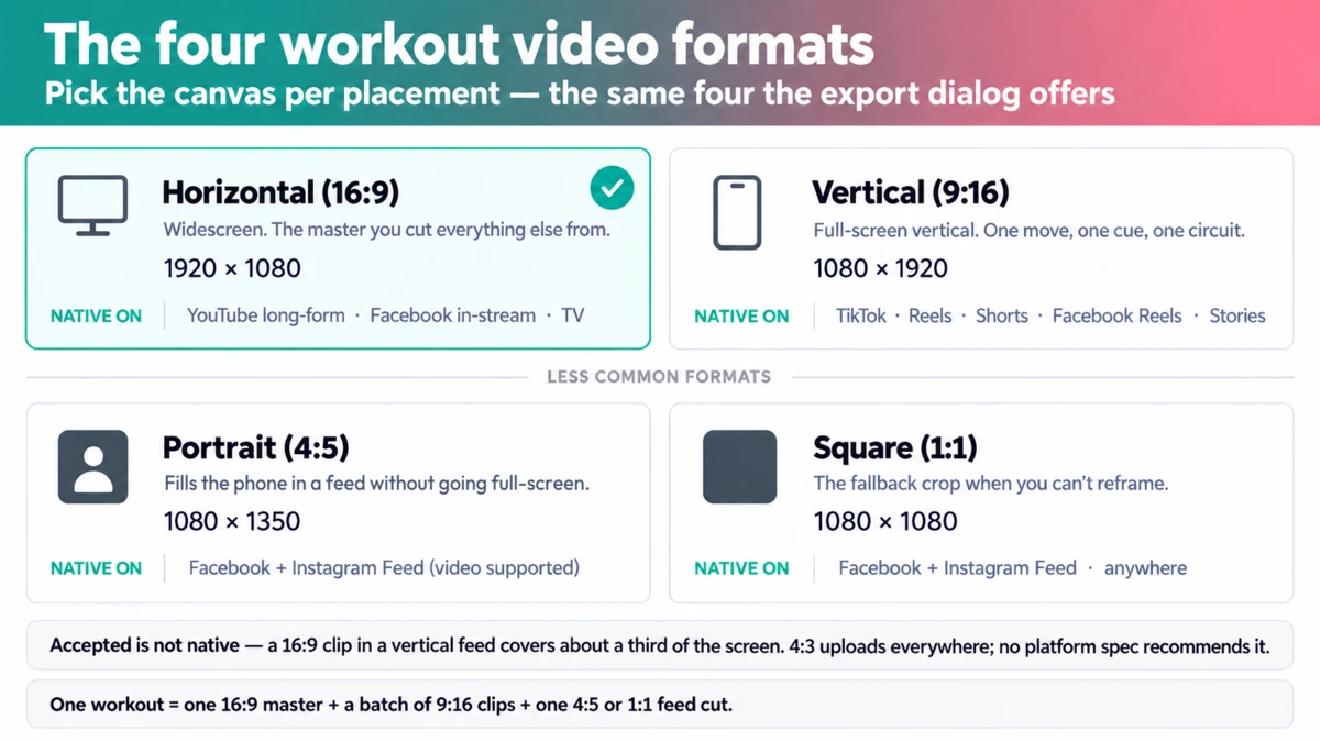
| Format | Pixels (Full HD) | Native home | What it's for |
|---|---|---|---|
 16:9 landscape 16:9 landscape | 1920 × 1080 | YouTube long-form, Facebook in-stream, TV | Full follow-along workouts and the main video you create other versions from |
 9:16 vertical 9:16 vertical | 1080 × 1920 | TikTok, Reels, Shorts, Facebook Reels, Stories | Short clips: one exercise, one tip, one circuit |
 4:5 portrait 4:5 portrait | 1080 × 1350 | Facebook and Instagram Feed | Feed posts that take up more of the phone screen without going full-screen |
 1:1 square 1:1 square | 1080 × 1080 | Facebook and Instagram Feed, general fallback | Useful when you need a simple crop that works in many places |
A few things are worth pointing out.
Platforms will accept other shapes too. For example, YouTube can play videos with different aspect ratios and automatically adjusts its player.
But accepted and ideal are different things.
You can upload a 16:9 horizontal workout to TikTok. It will work. But the video becomes a narrow strip across a vertical phone screen.
That means your athlete is smaller, your timer is smaller and much of the screen is unused.
For most workout content, it's better to create the video for the screen where people will actually watch it.
Which format plays natively where
A simple way to think about this is:
Use a format that fills the platform's normal viewing area without adding empty space around the video.
YouTube long-form
Use 16:9.
This is YouTube's standard format for regular videos. Other ratios will work, but YouTube recommends letting its player handle them instead of adding black bars yourself.
For full workouts, classes and follow-along sessions, 16:9 is still the natural format.
YouTube Shorts
Use 9:16 vertical.
YouTube also accepts square Shorts. Videos with a square or vertical shape can be classified as Shorts when they are three minutes or shorter.
If you want a video to stay a normal long-form YouTube video, 16:9 is the safer choice.
Instagram Reels
Use 9:16.
Instagram accepts several aspect ratios, but 9:16 fills the Reels viewer properly and avoids unnecessary cropping or empty space.
Reels can be longer than three minutes, but Instagram says Reels longer than three minutes are not recommended to new audiences.
For a full follow-along workout, YouTube is usually the better home.
For a short exercise, tip or circuit, use a Reel.
Instagram profile grid
The Instagram profile grid is taller than it used to be.
Your Reel may be 9:16 when opened, but its preview on your profile is cropped into a taller grid tile.
That means your cover still needs to work when part of the top and bottom is removed.
Keep the important subject and title near the center of the cover.
Facebook Feed
Facebook supports both 1:1 and 4:5 video in the Feed.
For fitness content, 4:5 usually gives you more screen space while still feeling like a normal feed post.
Square is useful when you need something more flexible.
Facebook Reels
Use 9:16, ideally 1080 × 1920.
TikTok
Use 9:16.
TikTok's upload system accepts many video sizes, but the main TikTok feed is vertical.
A horizontal video will upload, but it won't use the screen well.
The simple version
For one workout recording, you usually need:
- 16:9 for the full workout
- 9:16 for Reels, TikTok and Shorts
- 4:5 or 1:1 when you want a regular feed post
You don't need a separate format for every platform.
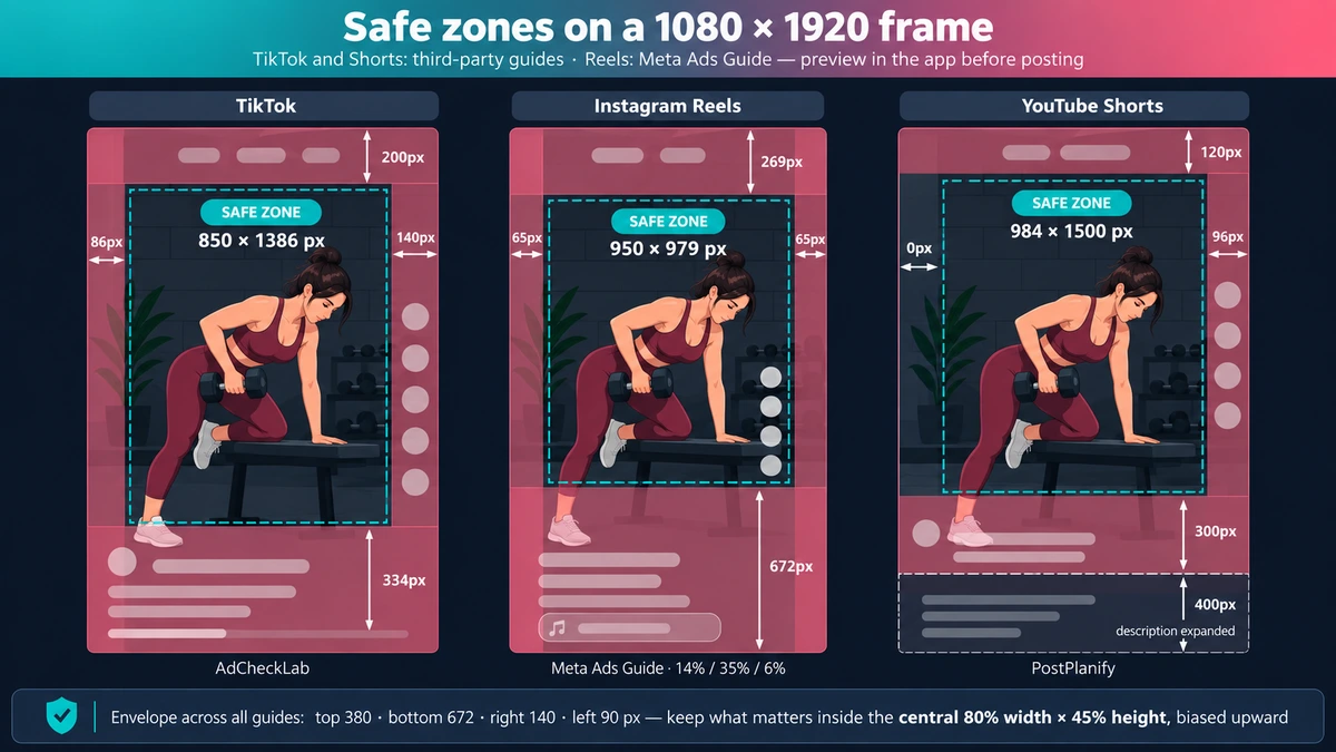
Safe zones: where the interface covers your workout
A safe zone is simply the part of your video that isn't covered by the app.
Think about what appears on top of a Reel or TikTok:
- username
- caption
- music information
- like button
- comment button
- share button
- navigation
- sometimes extra controls
Anything important underneath those elements can become hard to see.
The problem is that there isn't one official safe-zone size for every organic post.
TikTok, Instagram and YouTube also change their interfaces from time to time. Caption length can change how much space is covered.
Meta does publish guidance for Reels ads. Its conservative recommendation is to keep important text and logos away from roughly:
- 14% at the top
- 35% at the bottom
- 6% on each side
For a 1080 × 1920 video, that is about:
- 269 px from the top
- 672 px from the bottom
- 65 px from each side
Other guides have measured the current interfaces themselves.
Here is the range you will see:
| Platform | Guide | Top | Bottom | Right | Left | Stated core |
|---|---|---|---|---|---|---|
 TikTok TikTok | AdCheckLab | 200 px | 334 px | 140 px | 86 px | 850 × 1386 |
| TikTok | Ignite Social Media | 108 px | 320 px | 120 px | 60 px | — |
  Instagram Reels Instagram Reels | Meta Ads Guide | 269 px | 672 px | 65 px | 65 px | 950 × 979 |
| Instagram Reels | Ignite Social Media | 220 px | 420 px | ~35 px | ~35 px | 1010 × 1280 |
  YouTube Shorts YouTube Shorts | PostPlanify | 120 px | 300 px | 96 px | 0 px | 984 × 1500 |
| YouTube Shorts | YouTube Toolkit | 380 px | 380 px | 90 px | 90 px | 900 × 1160 |
The numbers differ because the apps change, devices are different and some guides use more cautious measurements.
So don't treat one rectangle as an exact rule.
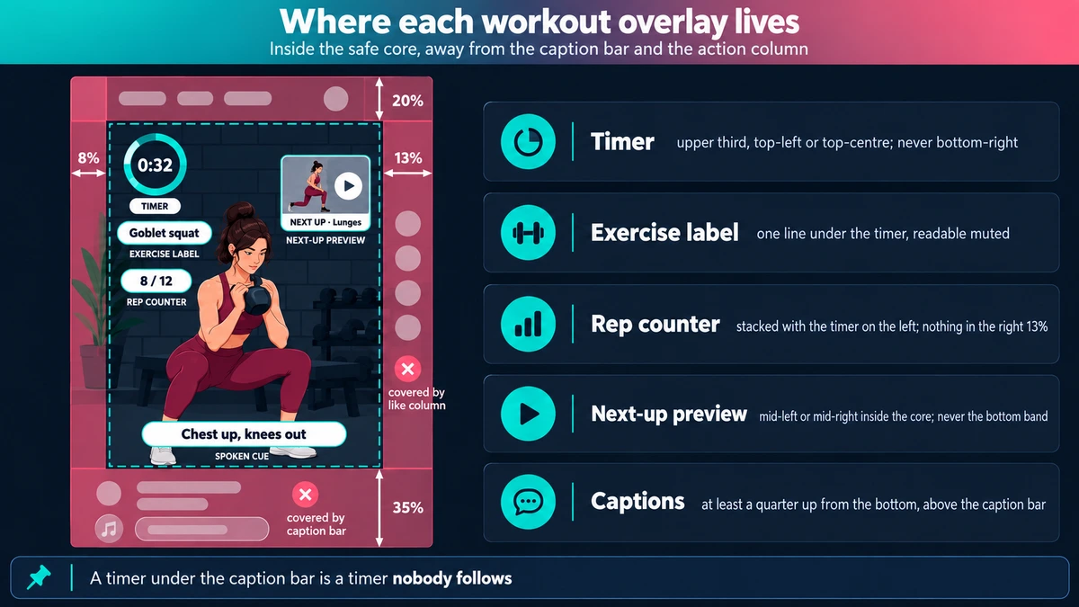
A practical safe zone
If you want one conservative layout that works across all three platforms, keep important information:
- away from the top 20%
- away from the bottom 35%
- away from the right 13%
- slightly away from the left edge
In plain English:
Keep the important parts near the middle of the video, and slightly above center.
Your athlete can extend outside that area. The safe zone matters most for information that must always be readable:
- timers
- exercise names
- rep counters
- captions
- logos
- instructions
And always preview the finished video inside the actual app before publishing.
That catches problems a template can't.
Where each workout overlay should live
Workout videos usually have more information on screen than normal short-form videos.
Here's a simple placement guide.
Timer / countdown
Put it in the upper part of the video, usually top-left or top-center.
Avoid the bottom-right. That's where most platforms place their action buttons.
Exercise name
Place it below the timer or near the upper center.
Keep it short and large enough to read quickly.
Rep counter
Upper-left works well, especially if it sits next to or below the timer.
Avoid the right side of the video.
"Next up" preview
Place it around the middle-left or middle-right, but keep it close enough to the center that platform buttons won't cover it.
Avoid putting it at the very bottom.
Captions for spoken instructions
Place captions above the platform's own caption area.
Don't push your captions all the way to the bottom of the video.
Logo / watermark
Small and near the top-left or top-right.
Keep it away from the outer edge.
The athlete
Keep the athlete generally centered.
For standing exercises, leave enough space above the head and below the feet.
This gets harder with floor exercises.
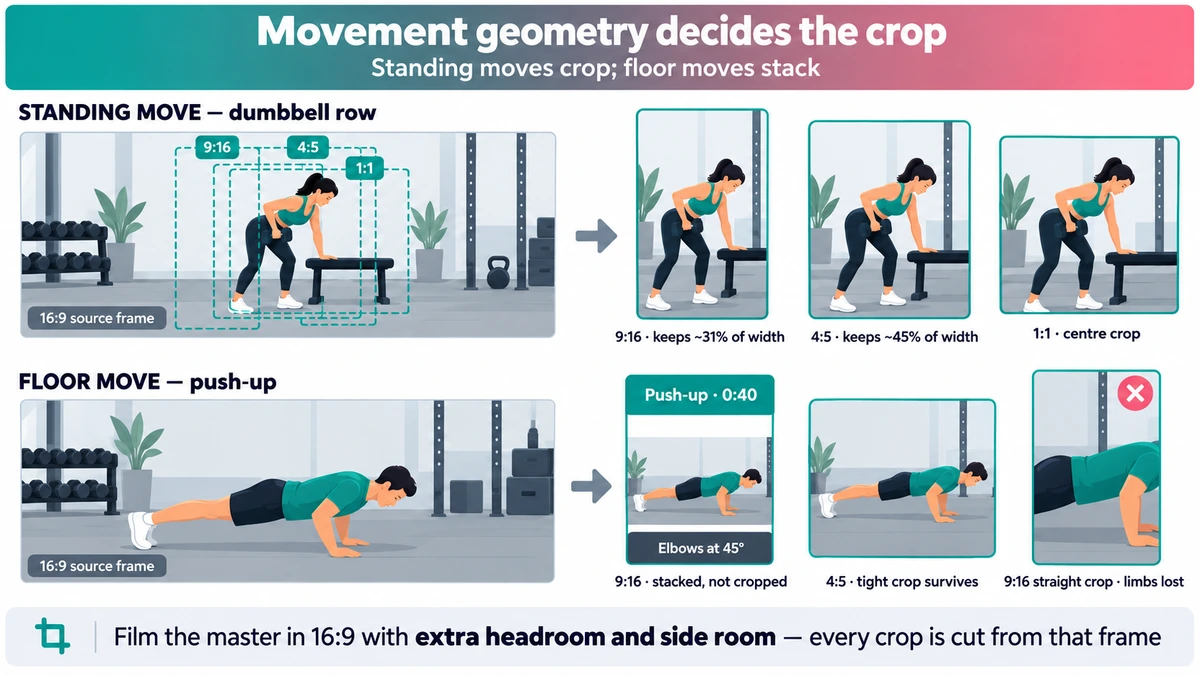
Movement geometry decides the crop
Not every exercise fits a vertical video the same way.
When you crop a 16:9 video into 9:16, you keep only about the middle third of the original width.
That's usually fine for someone standing upright.
It's not fine for someone doing a push-up.
A push-up, plank or glute bridge uses much more horizontal space. A tight vertical crop can remove the athlete's hands, feet or both.
A better approach is to treat exercises differently.
1. Standing and vertical exercises
Examples:
- squats
- shoulder presses
- rows
- lunges
- jumping jacks
These usually crop well to 9:16.
Keep the athlete centered and leave some extra space around the head.
2. Floor and horizontal exercises
Examples:
- push-ups
- planks
- glute bridges
- dead bugs
- side planks
Don't force these into a tight vertical crop.
Instead, keep the full horizontal video and place it inside the vertical canvas.
The extra space above and below can be useful.
For example:
Top area: exercise name + timer
Middle: full workout video
Bottom area: coaching cue or next exercise
You keep the whole athlete visible and gain space for information at the same time.
3. Mixed workouts
You don't have to choose one layout for the entire video.
A single Reel can use a normal vertical crop for a standing exercise and switch to the stacked layout for a floor exercise.
Change the layout when the movement changes.
4. 4:5 is more forgiving
A 4:5 crop keeps more of the original horizontal video than a 9:16 crop.
That makes it easier to fit floor exercises without cutting off hands or feet.
This is one reason 4:5 works well for feed posts.
Film with future crops in mind
The easiest way to make all of this work is to plan for cropping when you record.
For a 16:9 master:
- keep the athlete close to the center
- leave extra room on both sides
- leave slightly more headroom than you normally would
- avoid framing too tightly
Every vertical version has to come from the video you recorded.
You can't recover space that wasn't in the original shot.
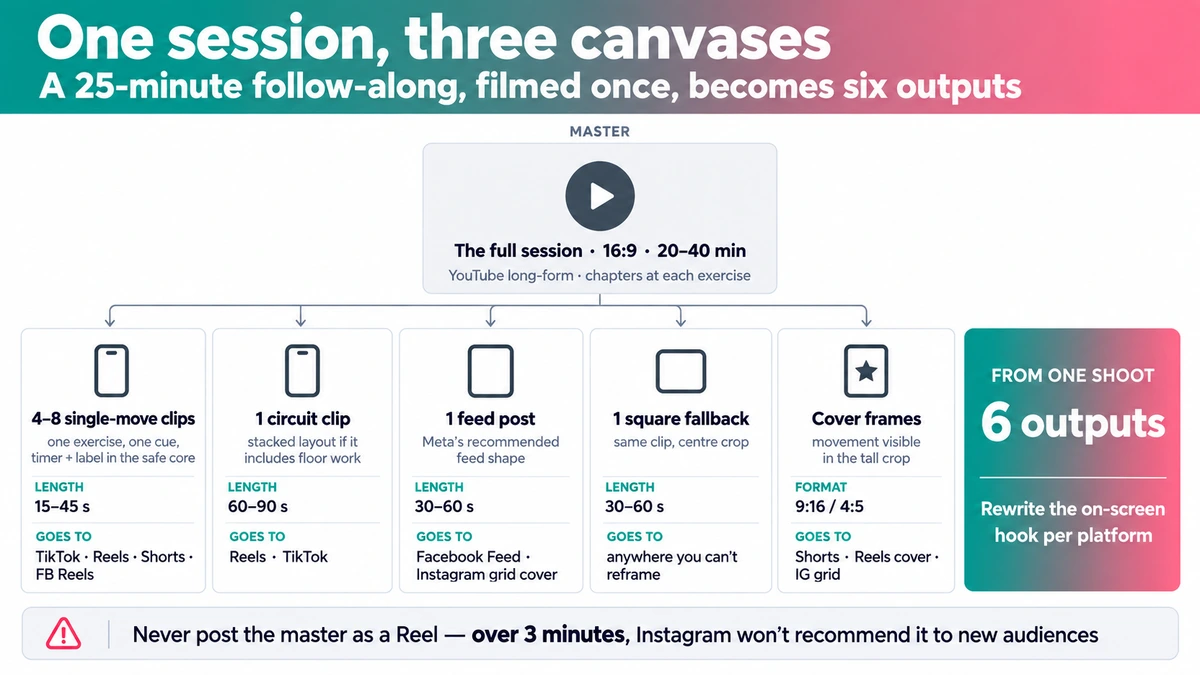
One session, three canvases: the repurposing matrix
Here's what one 25-minute workout could become.
These lengths are practical starting points, not strict platform rules.
| Output | Format | Length | Where | Notes |
|---|---|---|---|---|
| Full session | 16:9 | 20–40 min | YouTube long-form | Full workout with chapters |
| 4–8 single-exercise clips | 9:16 | 15–45 sec | TikTok, Reels, Shorts, Facebook Reels | One exercise or cue, with timer and label |
| 1 circuit clip | 9:16 | 60–90 sec | Reels, TikTok | Use a stacked layout if floor work is included |
| 1 feed post | 4:5 | 30–60 sec | Facebook Feed, Instagram Feed | Taller than square and works well in feed |
| 1 square fallback | 1:1 | 30–60 sec | General fallback | Simple centered crop |
| Cover frames | 9:16 / tall grid crop | — | Shorts, Reels, Instagram grid | Keep the important subject near the center |
You don't need to post the exact same clip everywhere.
A better approach is to reuse the video but adjust the packaging.
For example, the same exercise clip might have:
- one opening line for TikTok
- another for Instagram
- another for YouTube Shorts
Changing the first second or two can make the post feel native to each platform without creating a completely new edit.
Also avoid posting an entire 20-minute workout as a Reel just because Instagram technically allows long videos.
Use YouTube for the full session.
Use Reels, TikTok and Shorts to pull people into individual exercises, ideas and moments from it.
And check the cover before publishing. The cover should still make sense when Instagram crops it on your profile.
HD vs 4K: where resolution matters and where it doesn't
Aspect ratio decides how the workout fits on the screen.
Resolution decides how much detail the video contains.
Those are different problems.
| Surface | Accepts / recommends | What viewers typically get | Quality guidance |
|---|---|---|---|
| YouTube long-form | Supports up to 8K | Up to 4K on supported devices | Around 8 Mbps for 1080p and 35–45 Mbps for 4K at 24–30 fps |
| YouTube Shorts | Maximum 1080p | 1080p | Use a good-quality 1080p export |
| Instagram Reels | At least 720p; high-quality uploads supported | Typically 1080p-class delivery | Enable highest-quality uploads |
| TikTok | 360–4096 px per edge through its API | TikTok does not publish a fixed playback resolution | H.264 is recommended |
| Facebook Reels | 1080 × 1920 recommended | — | Use a high-quality vertical export |
4K matters most for YouTube long-form
YouTube is the clearest case for uploading in 4K.
A 4K video contains four times the pixels of 1080p, and the difference is easier to see on large screens.
That matters for workouts because long-form fitness videos are often watched on:
- TVs
- tablets
- large monitors
A 20- or 30-minute follow-along workout is very different from a 20-second phone clip.
One downside is processing time.
YouTube processes lower resolutions first. A long 4K video can take hours before the 4K version becomes available.
So upload 4K videos before you plan to publish them.
For short-form feeds, 1080p is usually enough
YouTube Shorts tops out at 1080p.
Instagram and TikTok also compress and re-encode videos after upload.
For these platforms, a clean 1080 × 1920 export with a good bitrate is usually more useful than simply uploading a much larger file.
For 60 fps 1080p video, around 12 Mbps is a reasonable reference point.
The important part is giving the platform a clean source file.
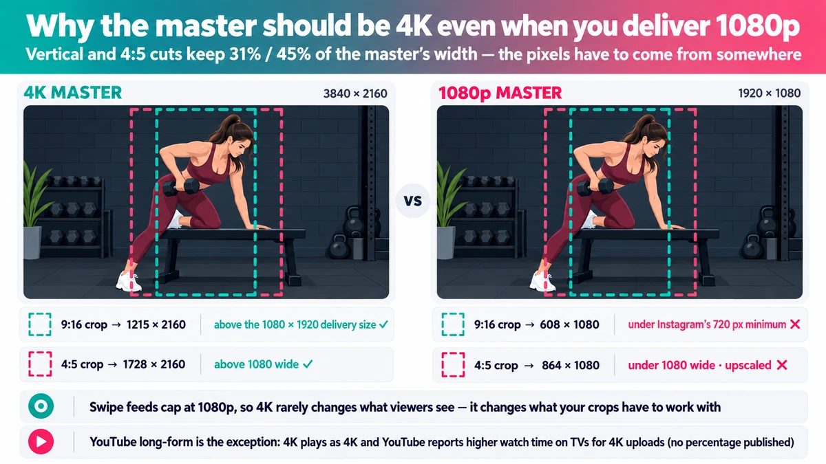
So why shoot the original workout in 4K?
Because of cropping.
This is one of the biggest reasons to record fitness content in 4K even if your final Reel is only 1080p.
Take a 16:9 master.
From a 3840 × 2160 4K recording:
- a 9:16 center crop is about 1215 × 2160
- a 4:5 crop is about 1728 × 2160
Both still contain enough horizontal pixels to create a sharp 1080-wide output.
Now start with a 1920 × 1080 recording:
- a 9:16 crop is only about 608 × 1080
- a 4:5 crop is about 864 × 1080
To turn the 608-pixel-wide crop into a 1080-pixel-wide vertical video, the editor has to enlarge it.
That means less real detail.
So the simple rule is:
You don't necessarily need to deliver every video in 4K. But recording the master in 4K gives you much more room to create vertical crops later.
For fitness content, that's often more important than the 4K upload itself.
Does 9:16 vs 4:5 vs 1:1 actually change engagement?
There isn't good public data showing that simply changing a video's aspect ratio from 4:5 to 9:16 causes a specific increase in engagement.
Large social-media studies, such as Buffer's and Socialinsider's, usually compare content types:
- Reels
- images
- carousels
- videos
They generally don't break results down by exact aspect ratio.
So be careful with claims like:
"4:5 gets X% more engagement."
Those numbers often come from advertising tests or individual marketing reports, not broad platform data.
What we do know is much simpler.
A 16:9 horizontal video uses only part of a vertical phone screen.
A 9:16 video fills it.
TikTok, Reels and Shorts are designed around vertical viewing.
And if the app interface covers your timer or exercise name, people can't use it.
You don't need an engagement study to solve those problems.
Use the format that fits the screen and keep important information visible.
The 60-second format check before you publish
Before publishing a workout video, check these:
- ✅ Master: 16:9, athlete centered, with extra space around them.
- ✅ Short-form clips: 9:16 for TikTok, Reels and Shorts.
- ✅ Floor exercises: use the full horizontal shot inside the vertical frame instead of cutting off the athlete.
- ✅ Timer and exercise name: upper-left or upper-center.
- ✅ Important information: away from the far-right side and bottom of the frame.
- ✅ Feed post: 4:5 or 1:1 if you're creating a regular Instagram or Facebook feed version.
- ✅ YouTube: don't add black bars yourself.
- ✅ Watermarks: don't leave another platform's watermark on the exported video.
- ✅ Final preview: open the video in the actual app on a real phone before publishing.
Check it with the caption visible too.
That's the easiest way to catch a timer, title or athlete that ended up behind the interface.
For titles, captions and hashtags, see Per-Platform Posting Best Practices for Fitness Creators.
For choosing which parts of a workout should become short clips, see How to Turn Workout Videos Into Reels.
And if you're producing a lot of workout content, the repetitive part can be automated. A fitness-specific editor such as ActiveSnap can create the 16:9 master, generate vertical versions, and place workout elements such as timers and exercise labels for you.
You should still preview the final post on each platform before publishing.